Dropdown (Bootstrap): Difference between revisions
Jump to navigation
Jump to search
(Created page with "file:Bsdropdown.png == Description == Toggleable, contextual menu for displaying lists of links. Introduction_to_Bootstrap#Popovers_and_Tooltips|Popovers and Tooltips...") |
|||
| Line 20: | Line 20: | ||
| clear || Clears all items. Runtime. | | clear || Clears all items. Runtime. | ||
|- | |- | ||
| | | grouping || Is this control part of a group? Choices are No, Start Horizontal, Start Vertical, Middle and End. | ||
|- | |- | ||
| | | groupStyle || The styling to apply to the entire group. | ||
|- | |- | ||
| icon || An optional [http://getbootstrap.com/components/#glyphicons icon] to appear at the top of the list. Design Time and Runtime. | | icon || An optional [http://getbootstrap.com/components/#glyphicons icon] to appear at the top of the list. Design Time and Runtime. | ||
|- | |- | ||
| items || Items to show, one per line. Prefix * for disabled, > for selected, ! for heading (not all controls support headings). Design Time. | | items || Items to show, one per line. Prefix * for disabled, > for selected, ! for heading (not all controls support headings). Design Time. | ||
Revision as of 10:25, 5 June 2016
Description
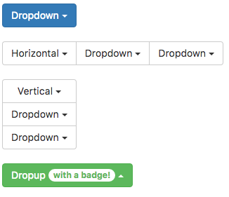
Toggleable, contextual menu for displaying lists of links.
Popovers and Tooltips are supported.
Properties and Methods
Standard properties are supported, plus:
| addItem(item, type) | Adds an item to the end. type can be "checked" or "disabled" . Runtime. |
| appearance | Appearance of the alert. Can be success, info, warning, danger. |
| badge | Adds a Badge to the control. Design Time and Runtime. |
| clear | Clears all items. Runtime. |
| grouping | Is this control part of a group? Choices are No, Start Horizontal, Start Vertical, Middle and End. |
| groupStyle | The styling to apply to the entire group. |
| icon | An optional icon to appear at the top of the list. Design Time and Runtime. |
| items | Items to show, one per line. Prefix * for disabled, > for selected, ! for heading (not all controls support headings). Design Time. |
| length | Items to show, one per line. Prefix * for disabled, > for selected, ! for heading (not all controls support headings). Design Time. |
| setValue(i) | Set the value (true or false) of line i. Runtime. |
Events
Standard events are supported. For this control, the onclick event will be most useful.
Example (Basic)
Go through all the checkboxes and see which ones have been chosen.
Function Checkbox1_onclick()
  Dim choices = "Choices: "
  For i = 0 To Checkbox1.length-1
    If Checkbox1.getValue(i) Then choices = choices & i & " "
  Next
  MsgBox choices
End Function
Example (JavaScript)
Go through all the checkboxes and see which ones have been chosen.
Checkbox1.onclick = function() {
    var choices = "Choices: ";
    for (i = 0; i <= Checkbox1.length - 1; i++) {
        if (Checkbox1.getValue(i)) {
            choices = choices + i + " ";
        }
    }
    NSB.MsgBox(choices);
};
