ToolTip: Difference between revisions
Jump to navigation
Jump to search
No edit summary |
|||
| Line 25: | Line 25: | ||
== Example == | == Example == | ||
To change the text of the tooltip at runtime, do the following: | |||
<pre> | |||
popupInfo.children[1].innerHTML = "My new text" | |||
</pre> | |||
== Output == | == Output == | ||
Revision as of 14:02, 13 March 2013
Description
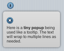
The ToolTip control is used to display a quick message to the user. If the icon is tapped on, the message displays. The user can then dismiss it. The width of the control is defined in the properties. The height is set automatically, depending on the text to be displayed.
Properties
Standard properties are supported, plus:
| close-icon-position | Where should the close icon appear? To the left, right or not at all? |
| message | The message which appears when the mouse is over the icon. Could be something like "Learn more". Does not do anything on touchscreen devices. |
| popupmsg | The message which appears when the icon is clicked. Can be formatted HTML. |
| tipWidth | The width of the tip. Can be in pixels (100px) or a percent of screen width (50%). |
Events
Standard events are supported. However, events are not usually associated with the control.
Example
To change the text of the tooltip at runtime, do the following:
popupInfo.children[1].innerHTML = "My new text"
