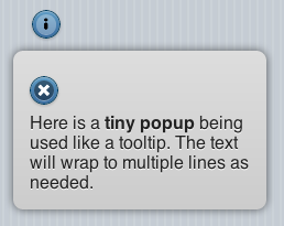
ToolTip
Description
The ToolTip control is used to display a quick message to the user. If the icon is tapped on, the message displays. The user can then dismiss it. The width of the control is defined in the properties. The height is set automatically, depending on the text to be displayed.
Properties
Standard properties are supported, plus:
| dividers | Is the item a divider? Comma separated list of Y and N. Design time. |
| dividerTheme | Which theme should all the dividers have? A-z. Design time |
| images | Image file names for each line, comma separated. Design time |
| imageStyle | None, 16x16 or 80x80. Design time |
| items | List of item names, comma separated.Items can be plain text or HTML. Design time |
| showNumbers | Show numbers to the left of each item. True/false. Design time |
| getItem(i) | Returns the text of item i. |
| getItemCount() | Returns the number of of items. Runtime. |
| deleteItem(all) | Delete all items. With no argument, just the last item is deleted. Runtime. |
| addItem(text, img, n, header) | Add a new item at postion n with text and img. text can be html. Runtime. If header is true, the line appears as a heading. Only text is required. |
| replaceItem(n, text, img) | Replace item n with new text and optional img. Runtime. |
| refresh() | Redraw list after updating. Runtime. |
Events
Standard events are supported. However, events are not usually associated with the control.
Example
Function List1_onclick(i)
  If TypeName(i)="object" Then Exit Function
  MsgBox "Menu item chosen: " & i & " " & List1.getItem(i)
End Function
Items can be formatted using HTML:
List1.addItem("<table><tr><td width=30>1</td><td width=200>Beschreibung</td><td>19.99</td></tr></table>")
You can change the color of the selected item:
List1.children[i].style.background="yellow"
Output
(message box showing “Menu item chosen: 2 Two”)
