Container


Description
The Container control is an HTML wrapper which you can use to create your own control or element. It was introduced in AppStudio 5, and replaces and enhances the Generic control.
It can be used to create customized HTML element by setting the HTMLTag property to <div> or the name of almost any other HTML element. The content property is the innerHTML of the element. It can be simple text or a complex HTML structure.
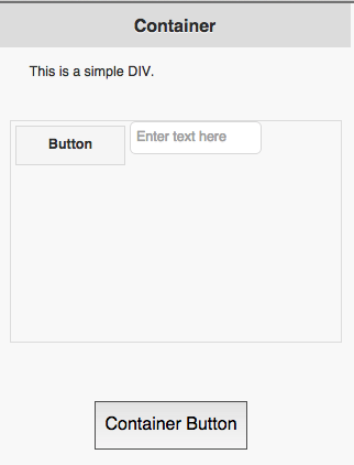
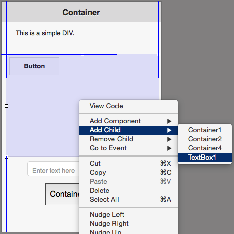
The Container control can also be used as a wrapper for other controls you have set up in your project. Add them to the Design Screen as usual, then right click in a Container and use Add Child. The control will then move into the Container. If you reposition the Container, the included controls ("children") will move with it. Use right click Remove Child to take a child out of a Container.
The positioning of controls in a Container defaults to 'relative'. When a control is added to a Container, its left and top properties are set to 'initial', and 'Float:left;' is added to the Style property. The result is that children in a Container act as Responsive Design elements: element flow and reflow is based on the screen size. If property is set to 'absolute', the top and left properties explicitly set the position of the children.
All the usual events are supported. Containers can contain other Containers.
To add a Container control to your app, choose the Container icon in the Toolbar, then position it on the Design Screen. Use the Property Editor to set the properties you need. Right click in the Container to add children.
At runtime, controls can be added as children using the addChild() function: Container1.addChild(Button1).
Properties
Standard properties are supported, plus:
| addChild(control) | control is added to the Control. Runtime. |
| attributes | A list of HTML attributes. To prevent jQuery Mobile from styling the element, use data-role=none. Attributes are separated by spaces. Design time. |
| center | Centers the contents, horizontally and vertically. Only works if HTMLTag is 'div'. |
| class | List of CSS classes to apply to the element. Class names are separated by spaces. Design time. |
| content | The text to use in between the HTML tags. Can be text or HTML. Design time. At runtime, use .innerHTML. |
| HTMLTag | The HTML tag of the control. Common values are div, button, text, ol, etc. For example. if value is 'button', then this HTML will be created: <button>content</button>. Design time. |
| innerHTML | The text to use in between the HTML tags. Can be text or HTML. Run time. At Design Time,, use content. |
| position | How children positioned. Default is 'relative': elements are positioned relative to each other and the size of the Container. With 'absolute', controls are positioned within the Container set by width and height. Other options are 'fixed' and 'static'. Design time. |
| style | A list of style properties, each in the form styleName:value; Example: "height:40px; width:100px".Design time. |
Events
Standard events are supported.
Examples
Change the color of the text
Container1.style.color = "red"