Panel (Bootstrap)
Jump to navigation
Jump to search
This control is Bootstrap 3 only. Use Card in Bootstrap 4.
Description
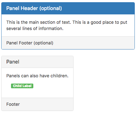
While not always necessary, sometimes you need to put your DOM in a box. For those situations, try the panel component.
If you change the contents of the header, value or footer at runtime, any children (including Badges) will be affected.
It can also act as a container for child controls.
Properties and Methods
Standard properties are supported, plus:
| appearance | Appearance of the control. Can be default, primary, success, info, warning, danger. |
| badge | Adds a Badge to the control. Design Time and Runtime. |
| footer | The text on the bottom. Leave blank for none. Design Time and Runtime. |
| header | The heading in the control. Leave blank for none. Design Time and Runtime. |
| position | How will the children be positioned? absolute, fixed, relative or static. |
| value | The text in the center of the control. Leave blank for none. Design Time and Runtime. |
Events
Standard events are supported.
Example
None - this is a passive control which simply displays.
