Alert (Bootstrap): Difference between revisions
Jump to navigation
Jump to search
No edit summary |
|||
| Line 7: | Line 7: | ||
Standard [[properties and methods|properties]] are supported, plus: | Standard [[properties and methods|properties]] are supported, plus: | ||
{| class="wikitable" | {| class="wikitable" | ||
|- | |||
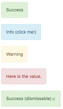
| appearance || Appearance of the alert. Can be success, info, warning, danger. | | appearance || Appearance of the alert. Can be success, info, warning, danger. | ||
|- | |||
| badge || Adds a Badge to the alert. | | badge || Adds a Badge to the alert. | ||
|- | |||
| dismissable || Add an x to dismiss the alert? | | dismissable || Add an x to dismiss the alert? | ||
|- | |- | ||
Revision as of 12:50, 31 May 2016
Description
Properties and Methods
Standard properties are supported, plus:
| appearance | Appearance of the alert. Can be success, info, warning, danger. |
| badge | Adds a Badge to the alert. |
| dismissable | Add an x to dismiss the alert? |
| value | The title of the button. Design time or runtime. |
Events
Standard events are supported. For this control, the onclick event will be most useful.
Example (Basic)
Function Alert2_onclick()
MsgBox "You can display a message or take other action when clicked"
End Function
Example (JavaScript)
Alert1.onclick = function() {
NSB.MsgBox("You can display a message or take other action when clicked");
};
