GridColumn (Bootstrap)
Jump to navigation
Jump to search
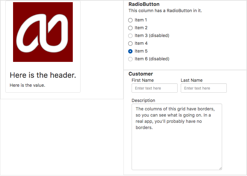
This screenshot has 3 Gridcolumn controls, each with its own group of children. The first Gridcolumn has a header, the second a Radiobutton and the third has a Cuatomer. Te arrangement will depend on the screen size.
Description
GridColumn is a container which can have a number of controls as children. It should be used as a child of a GridRow control. It has size properties which determine how wide it is depending on the size of the browser's screen. It is an important part of making apps responsive, so they appear differently on different screen sizes.
For more information on Bootstrap Grids, see Bootstrap Grids.
Properties and Methods
Standard properties are supported, plus:
| Number of columns (out of a total of 12) used by this column on large devices. |
| Number of columns (out of a total of 12) used by this column on medium devices. |
| Number of columns (out of a total of 12) used by this column on small devices. |
| Number of columns (out of a total of 12) used by this column on extra small devices. |
Events
None.
Example
Not applicable. See Grid for a complete sample with GridRows.
