Modal (Bootstrap): Difference between revisions
Jump to navigation
Jump to search
| Line 16: | Line 16: | ||
| badge || Adds a Badge to the control. Design Time and Runtime. | | badge || Adds a Badge to the control. Design Time and Runtime. | ||
|- | |- | ||
| footer || The text on the bottom. Leave blank for none. Design Time and Runtime. | | footer || The text on the bottom. Leave blank for none. HTML is allowed. Design Time and Runtime. | ||
|- | |- | ||
| footerAlign || Alignment of footer contents. left, center or right. Design time. | | footerAlign || Alignment of footer contents. left, center or right. Design time. | ||
|- | |- | ||
| header || The heading in the control. Leave blank for none. Design Time and Runtime. | | header || The heading in the control. Leave blank for none. HTML is allowed. Design Time and Runtime. | ||
|- | |- | ||
| size || Size of Modal control. small, medium or large. | | size || Size of Modal control. small, medium or large. | ||
| Line 26: | Line 26: | ||
| toggle() || Show or hide the Modal panel. | | toggle() || Show or hide the Modal panel. | ||
|- | |- | ||
| value || The text in the center of the control. Leave blank for none. Design Time and Runtime. | | value || The text in the center of the control. Leave blank for none. HTML is allowed. Design Time and Runtime. | ||
|} | |} | ||
Revision as of 12:11, 5 November 2016
Description
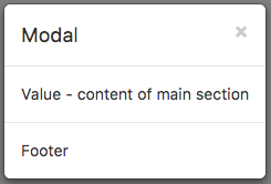
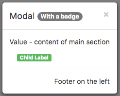
A Modal control displays a panel of information above your app. It can contain a header, detail or footers. By default, it is hidden, so it cannot be seen in the Design Screen. It needs to opened using its toggle function.
Since it does not display on the Design Screen, it can be difficult to edit. There's an easy solution. Add 'display:block' to the style attribute. Don't forget to remove it when you are done.
It can also act as a container for child controls.
Properties and Methods
Standard properties are supported, plus:
| badge | Adds a Badge to the control. Design Time and Runtime. |
| footer | The text on the bottom. Leave blank for none. HTML is allowed. Design Time and Runtime. |
| footerAlign | Alignment of footer contents. left, center or right. Design time. |
| header | The heading in the control. Leave blank for none. HTML is allowed. Design Time and Runtime. |
| size | Size of Modal control. small, medium or large. |
| toggle() | Show or hide the Modal panel. |
| value | The text in the center of the control. Leave blank for none. HTML is allowed. Design Time and Runtime. |
Events
Standard events are supported.
Example (BASIC)
Function Button1_onclick()
  Modal1.toggle()
End Function
Example (JavaScript)
Button1.onclick = function() {
    Modal1.toggle();
};

