Modal (Bootstrap)
Description
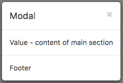
A Modal control displays a panel of information above your app. It can contain a header, detail or footers. By default, it is hidden, so it cannot be seen in the Design Screen. It needs to opened using its toggle function.
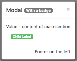
It can also act as a container for child controls.
Properties and Methods
Standard properties are supported, plus:
| badge | Adds a Badge to the control. Design Time and Runtime. |
| footer | The text on the bottom. Leave blank for none. Design Time and Runtime. |
| footerAlign | Alignment of footer contents. left, center or right. Design time. |
| header | The heading in the control. Leave blank for none. Design Time and Runtime. |
| size | Size of Modal control. small, medium or large. |
| toggle() | Show or hide the Modal panel. |
| value | The text in the center of the control. Leave blank for none. Design Time and Runtime. |
Events
Standard events are supported.
Example (BASIC)
Function Button1_onclick()
  Modal1.toggle()
End Function
Example (JavaScript)
Button1.onclick = function() {
    Modal1.toggle();
};

